Effectively identifying pupils for intervention using bell curves
When I was an NQT, I can vividly remember writing out a list of interventions for every child I felt needed personalised help after an assessment. This document ended up being about a page and a half of A4 for one of my 10 classes and, I’m ashamed to say, I wrote it, filed it and then didn’t look at it again until the next assessment. It wasn’t that I didn’t help those who needed it; I went over topics that many children found difficult, we picked apart the assessment as a class and I adjusted the seating plan to make sure that I could easily access those who I felt needed extra help. The reason the intervention sheet was consigned to the dreaded folder was that providing individualised interventions for 10 to 15 children out of a class of 30 simply wasn’t feasible.
Intervention is a valuable tool and it is a core part of diagnostic teaching. However, identifying which pupils are truly in need of extra support or extra challenge is just as important as how we go about these interventions. This is particularly the case when working with sets; sometimes the temptation is to assume that setting is, in itself, the most effective form of intervention. However, it is highly unlikely that you will ever teach an entire cohort at once. As a result, intervention should be about identifying pupils those who you should prioritise within each individual class, not within the cohort as a whole.
In order to solve this issue of where to concentrate my resources, I turned to two of the most trusted tools in a modern teacher’s toolbox: spreadsheets and statistics. Following last summer’s assessments and the most recent assessment cycle (December), I have been using bell curves to identify those pupils who are over- and underachieving within their sets.
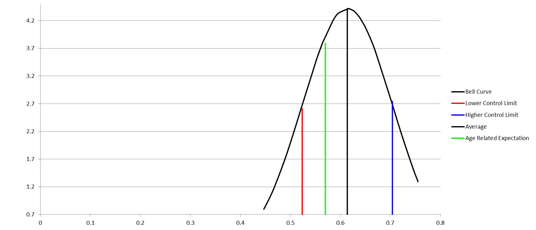
The X axis shows the pupils’ overall percentage in their assessment and the Y axis shows the frequency of different results. Underachievement is defined as any result which is more than one standard deviation below the average result for this class. Overachievement is defined as any result which is more than one standard deviation above the average. The “Age Related Expectation” is what the lead teacher for this year group (who wrote the assessment) would expect the average pupil to achieve in that assessment. This graph would also normally have a list of pupils who fall into the “blue” and “red” categories with their overall percentages.
The graph above is from a top set. My first step was to use the lists generated with this class (not shown) to adjust my seating plan. I then used the graph to help plan my “Dedicated Improvement Time” lesson and to plan how I am going to intervene with the class in the long term. The graph, along with my own observations, allowed me to make three main conclusions about this class’ performance and how I should approach intervention: Firstly, as this is a fairly steep ‘bell’, the results within this class fell within a quite a small range, suggesting that most pupils understood the content and they probably had similar areas of difficulty. Secondly, on average, the pupils in this class are performing above the age related expectation. However, this was only by roughly 5%, suggesting that they made need some further practice with extended questions to ensure they can widen this gap in the next assessment. Thirdly, most of the pupils who have underachieved are still within roughly 5% of the age related expectation. This, combined with evidence from books and my own observations, suggests that those pupils who are underachieving understand most of the core concepts from the unit, but need help developing and explaining their ideas. Their lack of complexity limited the marks they achieved in analysis or discussion questions.
The more we teach classes, the more we get to know them. The vast majority of teachers will be able to identify the pupils in their classes who need extra help or extra challenge. By this logic, bell curves simply reinforce what we already know from what we see in the classroom. Indeed, during my own experiments with these graphs, I continually went back to question level analysis, books and my own observations to help explain what I was seeing. However, using bell curves to identify pupils for intervention has also allowed me to do several things confidently: they have helped me to identify those (often quiet) pupils who need extra help but don’t ask for it, they have encouraged me to tailor my interventions within classes, rather than just looking at a cohort as a whole, they have allowed me to have meaningful whole class discussions about attainment and, perhaps most importantly, they have allowed me to accurately identify those pupils who need extra challenge, as well as those who need extra help.
Create your own bell curve
4319